『 Windchime ☆ Layouts 』
|
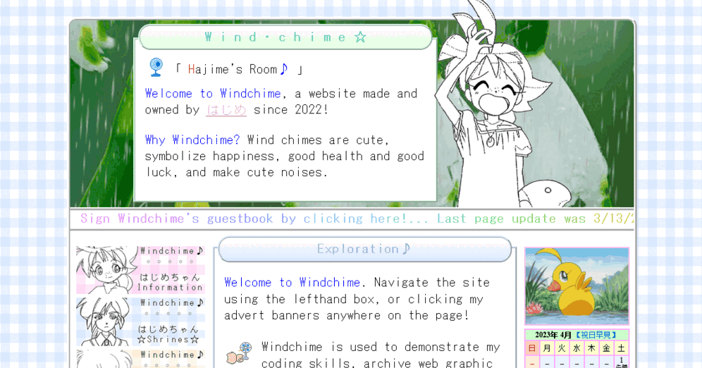
"The Original Windchime" 2023年3月13日
Rank: ★★★☆☆
Click here
to view it live!
|
The first design for Windchime when it was first made. I like this version because of its colorfulness! I also like that compact yet clean look. Alas, it wasn't the most efficient... For many reasons. I had a lot of advert banners for my pages, but... none of the pages were actually working yet...
I also had no idea what the other pages should look like. I had planned a unique layout for the shrines and digest pages, respectfully, but everything else, I had no clue. I feel bad ranking it so poorly, but it was just not useful. Sometimes, design is not everything, I've learned.
|
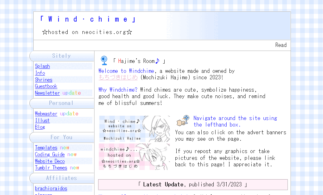
"Bliss" 2023年3月23日
Rank: ★★★★☆
Click here
to view it live!
|
The first major design change to Windchime, and the second overall change. Better! I like this one because it looks a bit more professional but still personal.
I try to plan the building of something that you want people to look at and visit often ahead of time. At this point, I figured that the website would look best and possibily be more memorable to viewers if it had a specific look rather than each page being unique with a different design.
Again, not the most efficient design, it was a pain to update the site because I wasn't using iframes at the time. But an improvement from before. There were some actual existing pages, and I knew how to design each one when I didn't have to tackle the entire page and just had to worry about styling the content itself.